DISCONNECT – the publication

'22

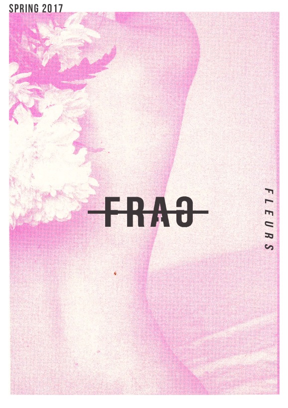
Ive chosen to create a publication called disconnect as my final piece. Ive created a colour scheme within my work that I feel is subtle and almost reflective of ‘hospital colours’ to relate to the mental health theme. This is juxtaposed by the bright red flashes I will have within my publication and also of the logo, I think this offsets the subtle colours and also relates to a red cross as a medical symbol. The logo is deliberately off centred to compliment the word – disconnect, using the T on the end of the word as the disconnection.

ABSTRACTION


Furthering my technique of blurring my imagery to disconnect the identity of the subject. I am now furthering this by completely abstracting the image so that it is unrecognisable from the original collage. Using different papers and slices of imagery I have abstracted the original work, I feel this again relates to feelings of being disconnected and almost to the point of being completely lost. It has stemmed quite far from my original collages but I am welcoming the more abstract appearance and actually really like the way these look paired with the less abstract original images.

BLUR & SMOKE


I have been experimenting more with how I can visualise mental health and carrying on with the theme of masks and ‘smokey’ shapes as a way of showing this in my collages. I am aiming to use these elements of my work to tell the story of poor mental health without creating an image that is ‘sad’ or obvious and transparent. Depression, and poor mental health is something that disconnects a person from their identity, by using digital techniques I have blurred and distorted the faces of my subjects to show this in my work.

SEPARATION OF MIND FROM BODY


In these collages I wished to create a feeling of disconnection within the image, to help visualise the internal struggles a person with poor mental health might be experiencing. Men in particular are more likely to to not share their problems with others, which is one of the reasons why young mens mental healths is such an important issue in the uk. In my work, to show their struggle I have disconnected the mind from the body using this detached ‘mask’ motif, this symbolises their struggle in a powerful way.

DISCONNECT

bizarre-self-portrait-photography-ben-zank-11
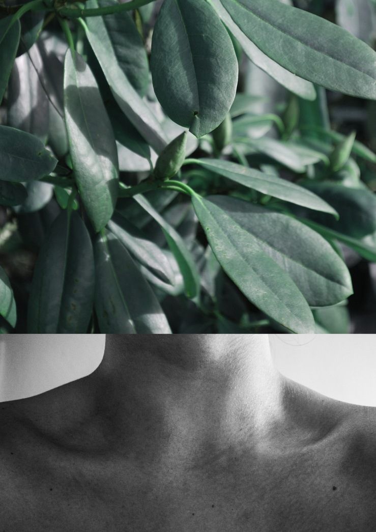
Disconnect is a concept i have recently come up with to contextualise my new project about mens mental health. I really want to carry on with my theme and aesthetic that is fragmented and also using collage. In this I aim to visualise and educate about the facts of mens mental health in the uk, and create a talking a point. It is a subject that im particularly passionate about and because of this want to pursue the theme.
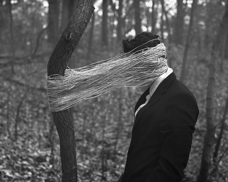


Featured image is photography by Ben Zank.

RISO

IMG_1572

something I really want to experiment more with in this project is using Risograph printing in my work. I feel like it is a natural progression for me as I really enjoyed working with the medium last term and I feel that photography and collage works really well Riso printing. Another target for me is incorporating a lot more colour into my work as although I love black and white photography and minimal aesthetic I just want to experiment more with vibrant colours, Risograph printing allows me to do this whilst still keeping things within a minimal colour palette.

BOTANICAL

selfie.jpg


Something I really want to explore more is the fascination and relationship between ourselves and nature.

Using my photography I created these collages in order to comment on the inherent and unrelenting relationship between ourselves and the natural world, even down to the similarities of our outward appearance. Although I desire to highlight the homogeneous relations between man and nature, I also wished to highlight the various characteristics that set the human form apart from that of the natural by using juxtaposition to contrast the images.

PROUD FLESH – SALLY MANN


Sally Mann’s series of photographs titled ‘Proud flesh’ explores the nature of our bodies. The photographs are very close up, taken in an almost too personal closeness, as though pressed against the camera. The photographs are also cropped tightly to the subjects to leave little vacant space, but also fragment to the images into snippets of photographs, so the viewer is unsure of what exactly they are looking at. Created using dark room photography, there is a ghostly filter that unite all of her series of works, which creates a smudged imperfect appearance to the photos which i find really nice. I would also like to produce work in where the figure or subject matter is unknown to the viewer as this really fragments an image.

ZEMBLA: VINCE FROST


Another source of inspiration is from Vince Frost’s Publication Zembla. Zembla’s headline ‘fun with words’ seems very fitting as the typography featured is experimental in appearance. This is juxtaposed by the sleek glossy feel of the design on the magazine, with quality images and clean lines throughout. I particularly like the way text is incorporated into the actual imagery, the feel of this is very fluent whilst still being edgy.

SNIFFIN GLUE

I will also be taking inspiration for my publication from Mark Perry’s Punk Zine Sniffin Glue. I have always been inspired by punk culture and featured this zine in my essay on fragmentation. I love the cut-n-paste no frills aesthetic of the Zines and the hand drawn scribbled titles. This to me really embodies themes of fragmentation, and shares aspects I will consider including in my publication.