TYPE INSPIRATION: PIET ZWART

Piet Zwart was a pioneer for modern Typography, combining his knowledge of architecture and the written word he created imagery that became revolutionary for graphic Design. His use of Primary colours, clean bold lines and sans serif fonts are key to his practice. I am particularly inspired by this as I feel it has a really fragmented aesthetic that would work well with the style of publication i am aiming to create.


“The work that Zwart did for the NKF Company can be spotted by his use of primary colors, clean sans-serif typography and photo-montage. Formally trained as an architect Zwart referred to himself as a hybrid between a typographer and an architect.”

http://www.designishistory.com/1920/piet-zwart/


MERZ

Merz was an avante-garde publication that Kurt Schwitters created between 1923 and 1932. There was only ever twenty five issues of Merz created in this time, and they all reflected the views of Dadaists and Dada culture.

His definition of Merz:

“In the war, things were in terrible turmoil. What I had learned at the academy was of no use to me and the useful new ideas were still unready…. Everything had broken down and new things had to be made out of the fragments; and this is Merz. It was like a revolution within me, not as it was, but as it should have been.”

http://www.designishistory.com/1920/kurt-schwitters/

Merz was revolutionary for Graphic Design, using the classic cut and paste dada technique this typography is proving that the written word is also an opportunity for visual imagery. This research has served me as inspiration for using Typography within my work and also looking at how i could incorporate text in a publication.

FORGOTTEN: ROWTOR ROCKS & CIRCLE STONES

Recently i took a walk in the peak district to see the Rowtor Rocks. Rowtor Rocks at Birchover are a collection of disturbing remains said to have been for the Ancient Order of the Druids Society around 1781.

“Carved in and through the gritstone of Rowtor Rocks are caves, rooms, alcoves, tunnels, flights of worn stone steps, a stone armchair, a square font, cup and ring markings, rock basins and square sockets which may have supported crosses.”

http://www.derbyshireheritage.co.uk/Menu/Curiosities/rowtor-rocks.php

ContactSheet-002.png

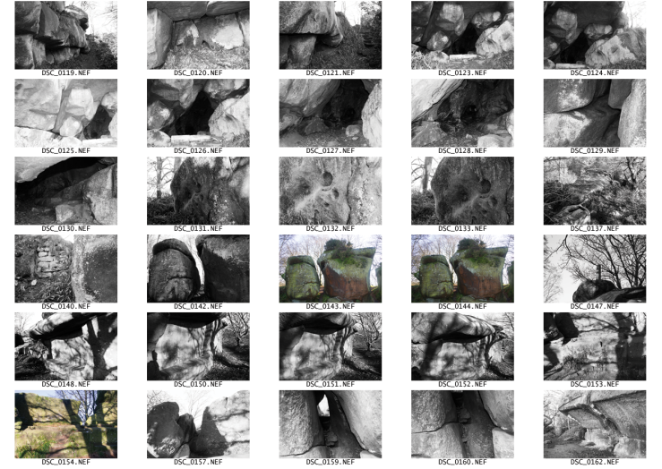
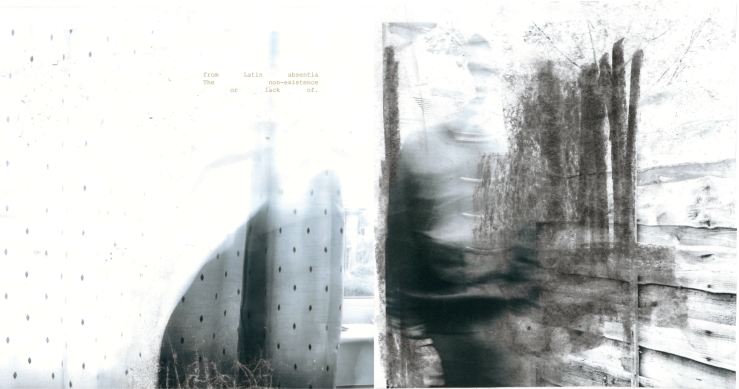
I decided to photograph these rocks for my Practical work on Vacancy, there is something quite haunting about the remains, and the fact that they have been forgotten but still continue to exist within the trees. I thought this idea was fitting for my Project, and it also allows me to experiment more with different styles of natural images.

Whilst on that walk i also came across ‘The Grey Ladies’ circle stones

“Stone circles were built in the Peak District during the late Neolithic and early Bronze Age is and the reason for them all is not altogether clear, although it is mainly thought they had a religious purpose.”

lhttp://www.peakdistrictonline.co.uk/stone-circles-c101048.html

DSC_0173.png

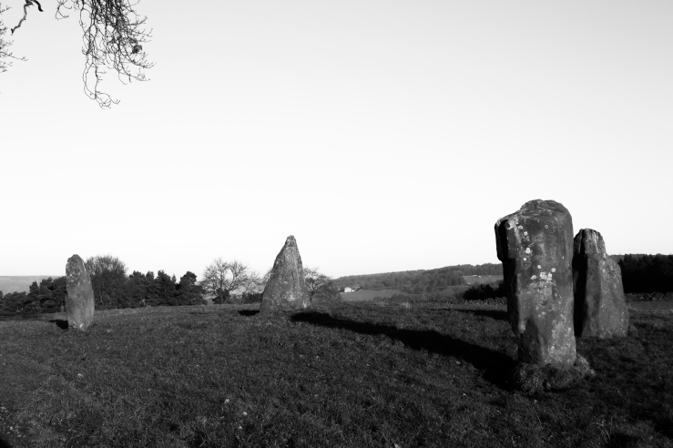
Again there is something incredibly disturbing about these remains, The grey ladies in particular fit with themes of Vacancy as there are only four stones left, whereas there should be about 9 in the circle. I want to experiment more by pairing nature photography with the man made/portraits I have took to create a nice contrast of imagery.


WINDOWS & TEST HANDS

Another embodiment of Vacancy i have been photographing are windows. Not only are they lovely to photograph, allowing you to experiment with light and shadows. But they also convey a sense of emptiness… just a large pane of glass. To me, this is almost a Void, and in turn creates a feeling of vacuity.

Again in these photographs i’m experimenting with motion blur, to allow me to do this i stand behind the camera with my hand in front of the lense to test how the image/ the motion will look. The test images of my hand, actually have turned out to be some of my favourites. It has become a motif in my work and also in my opinion fits so well with themes of Vacancy, it is almost like a hand reaching for something.


PHOTOGRAPHING VACANCY: A SINGLE CHAIR

After my first assessment I began taking more photos around my theme of Vacancy and also Fragmentation. This led me to question what I believed embodies these themes. I began experimenting by taking photos of a single chair in a room, i feel this imagery has been used often in the art world and throughout history to symbolise other themes such as loneliness or to create an atmosphere of something being forgotten or left behind.

In my images I wanted to capture a photo that was disturbed in appearance, creating an unsettling atmosphere, as this compliments the darkness of the theme. I also wanted to keep the photography black and white as i think this somehow adds to the feeling of the imagery. Again, I took the photos with extremely high contrast and experimented more with motion blur as this compliments themes of fragmentation.

ANDY WARHOL

I visited the Andy Warhol exhibition at the Whitworth recently and felt particularly inspired by his photography work and screen prints. I noticed in Warhols work he really emphasises the contrast in his photos, making the light incredibly bright and the dark aspects very black. This aesthetic is something i really like the look of, as it adds more depth to the photos. I also like how Warhol creates many versions of the same image and displays them together as an almost sequence, i think this is very effective when displaying your work.

WEEGEE

Alget Weegee is a renowned street photographer working in the 1930’s -40’s, famously known for his stark black and white photography. He was a press photographer that focused his work mainly on capturing the crime that took place in the city. Because of this, there is a very raw feel to his work, that gives the feeling of no messing around but instead taking quick snapshots. His work has an incredibly realistic vibe as it portrays the goings on of the era, I really like this aspect of his photography as it creates a feeling of being in the moment.


MEATYARD

Ralph Eugene Meatyard was an inspiring photographer circa 1960. His work was very provocative of the time and he tended to work outside of the mainstream. a reoccurring theme i have noticed in his portfolio is the use of masks, he created photographs that have a really uneasy feeling to them, many involving children wearing the heads of old ugly men. This concept is something i find relatively disturbing but the output looks fascinating and really creates drama within a photograph. His work also tends to involve a lot of long shutter speed motion blurs, something i have been trying to recreate in my images also, as i find this technique creates really interesting responses. I also really like the high contrast images, as this is something i am trying to portray in my own photography. Another Photography technique i am keen to learn about is gelatin silver printing. Especially with black and white photography, i just dont feel you can get the same quality with printing a photograph as you can with wet photography. This is something i am going to look at further.

NEVILLE BRODY ALBUM ART


I came across the work of Neville Brody recently, and immediately felt inspired. i really like the combination of photography with digital design. His use of loud colours and graphic style becomes quite ‘in your face’ and heavy on the eye. These record sleeves in particular appealed to me for that reason. I feel as though this could act as inspiration for my own practice, but a slightly more toned down aesthetic, as his work appears quite provocative and almost shocking. I also like the use of typography on the sleeves, as this is something i want to incorporate more within my images.

VACANCY IV

screen-shot-2016-11-10-at-11-38-31

To conclude the work I have done so far for my Hand In, I created these ‘Finals’ of my manipulated images. I chose the photos i am most happy with, and the ones i think put my theme of vacancy and Absence across strongest. I decided to pair a couple of these photographs together to convey the idea of a possible sequence or events that could be linked. I chose images that i thought would compliment each other also, using light and darks and positive and negative space. I also decided to incorporate text into the finals, I did some research on the words ‘Vacancy’ and ‘Absence’ and used their definitions from the online oxford dictionary, although this is a literal definition i think without knowing it is, it begins to ask questions in my work, which is something i have been aiming at. I chose to use contrasting coloured text to stand out from my monochrome finals, i like the way this disturbs the image, i also wanted to blend the text into the image instead of having them separate. I chose to make the composition of the text fragmented as this ties in with my previous experiments and I really like the way this looks with my images.